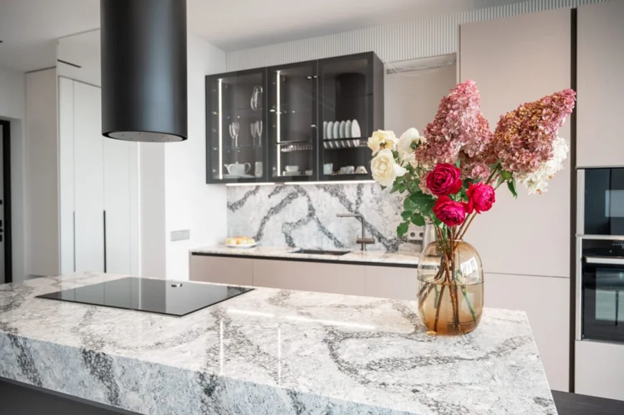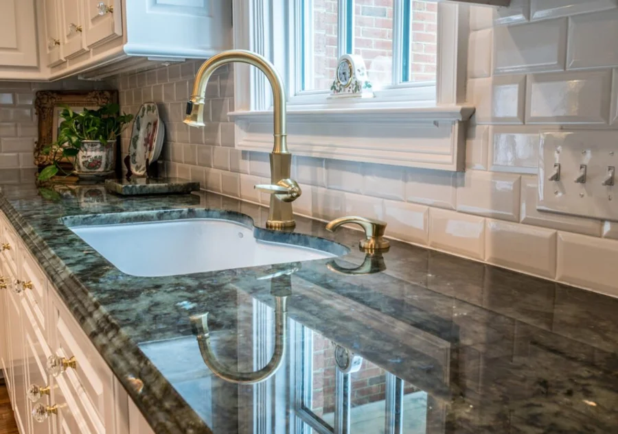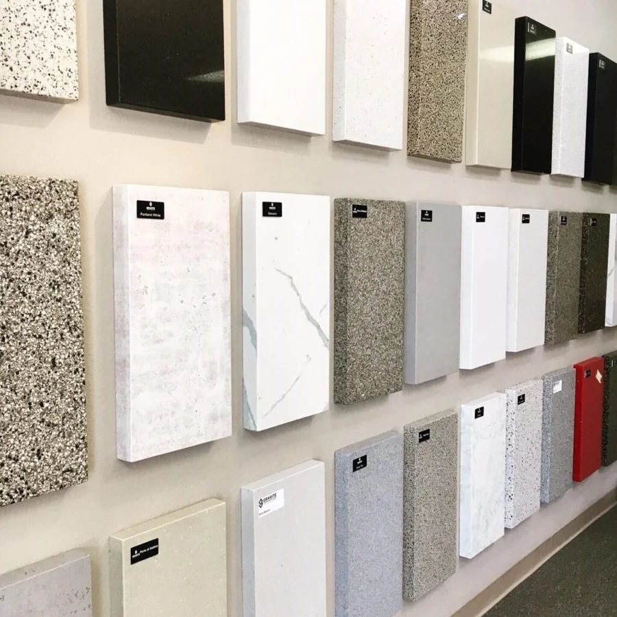

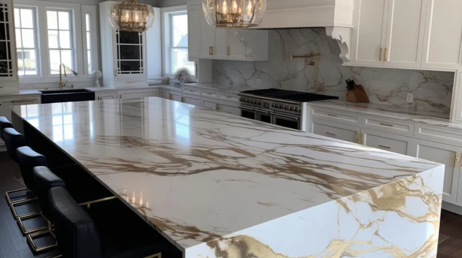
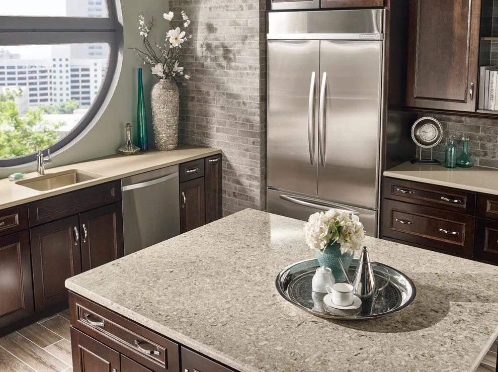
There is no single verified best-selling quartz color across every brand and market. If you want a versatile starting point, compare white and off-white quartz, then narrow the choice by undertone and pattern. The ten examples below help you identify a look you enjoy, including older designs that now serve as references for finding an available alternative.
Choose a color family before a product name
A white countertop can lean cool, creamy, gray, or slightly golden. Those differences become more obvious when the surface sits beside cabinets, tile, and flooring.
Our quartz countertop selections are a useful starting point for comparing design directions. Bring a cabinet sample or clear photos of the finishes that will stay in your room.
This list is an editorial selection, not a sales ranking. Some names from the original guide have been removed or discontinued by the manufacturer, so treat those examples as visual references rather than promises of availability.
Ten quartz color ideas
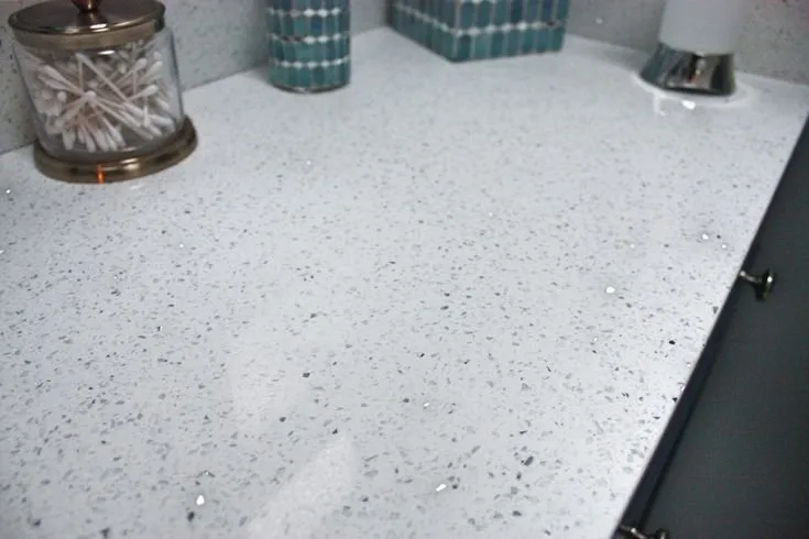
1. Sparkling White: brightness with visible texture
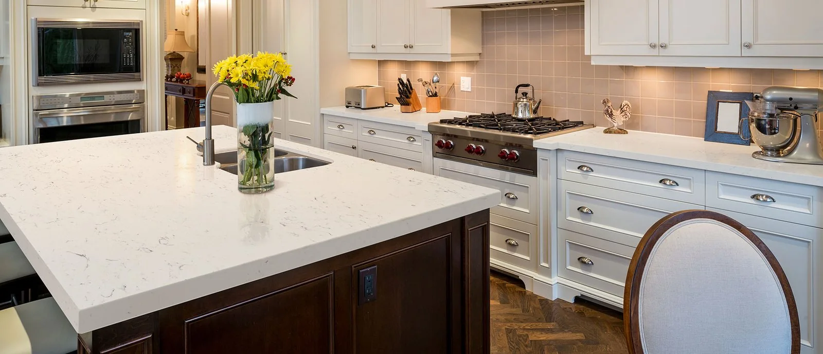
Sparkling White combines a white background with reflective speckling. It can appeal if you want a light surface with more visual texture than a plain solid.
View a sample under the lighting you plan to use. The sparkle may be more noticeable under focused light, so decide whether that effect belongs in the room before ordering.
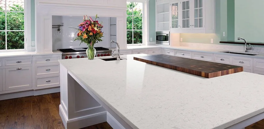
2. Glacier White: a softer white reference
Glacier White illustrates a softer, clouded white direction rather than a sharply uniform background. It can help explain the difference between a crisp white and a more layered pale surface.
MSI marks Glacier White as removed or discontinued. If that is the look you like, ask to compare currently available samples with similar white and muted gray characteristics.
3. Rocky Mountain: subtle stone-inspired movement
Daltile's Rocky Mountain belongs in a comparison of pale, stone-inspired quartz designs. Use the actual sample to judge its undertones and movement instead of relying on the product name.
It can be a useful reference for a bathroom or kitchen where you want texture without a forceful pattern. Compare it alongside the tile and cabinet finish at the same time.
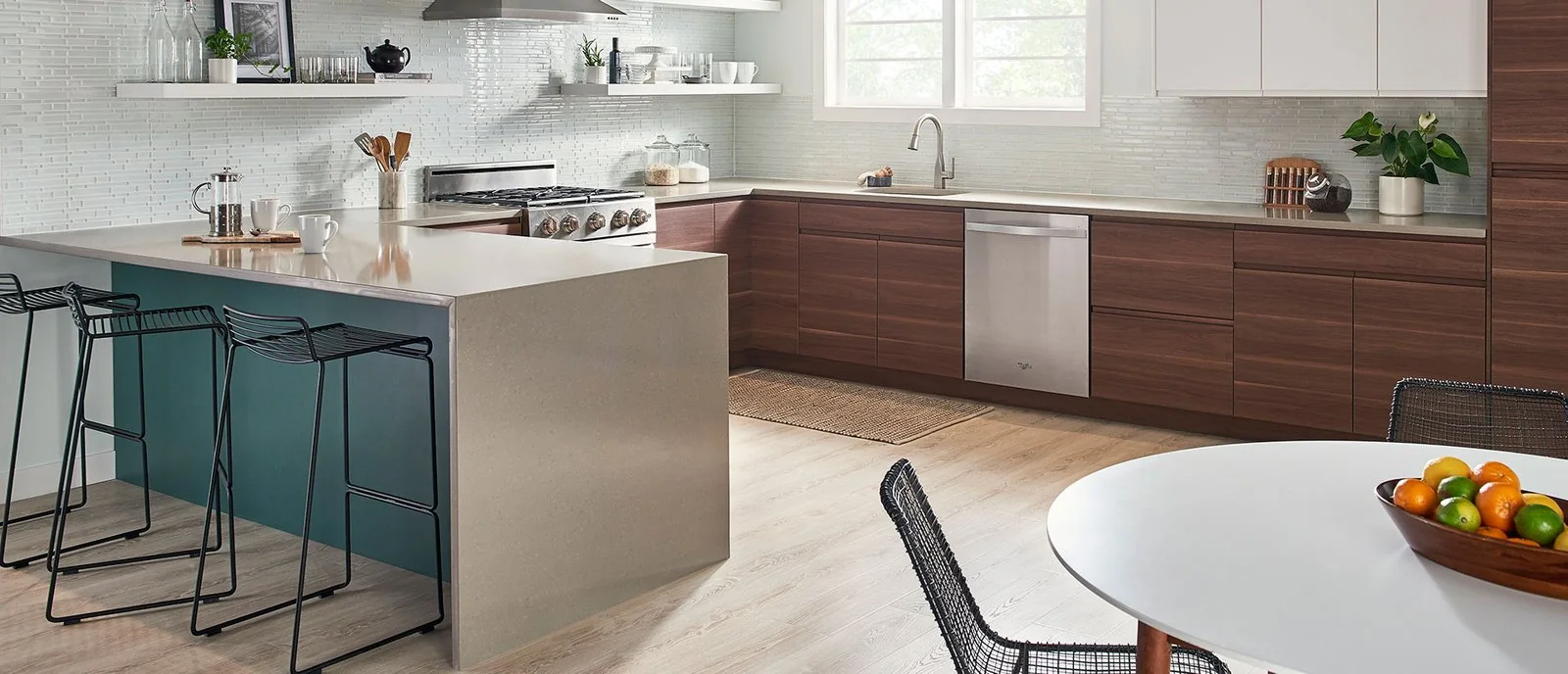
4. Chakra Beige: warmth and layered detail
Chakra Beige introduces a warmer direction for someone who finds bright white too stark. Its beige and cream character can connect with wood cabinetry or earthy finishes.
The pattern deserves space in the design. If the countertop already has visible detail, try it with a simpler backsplash before adding another busy surface.
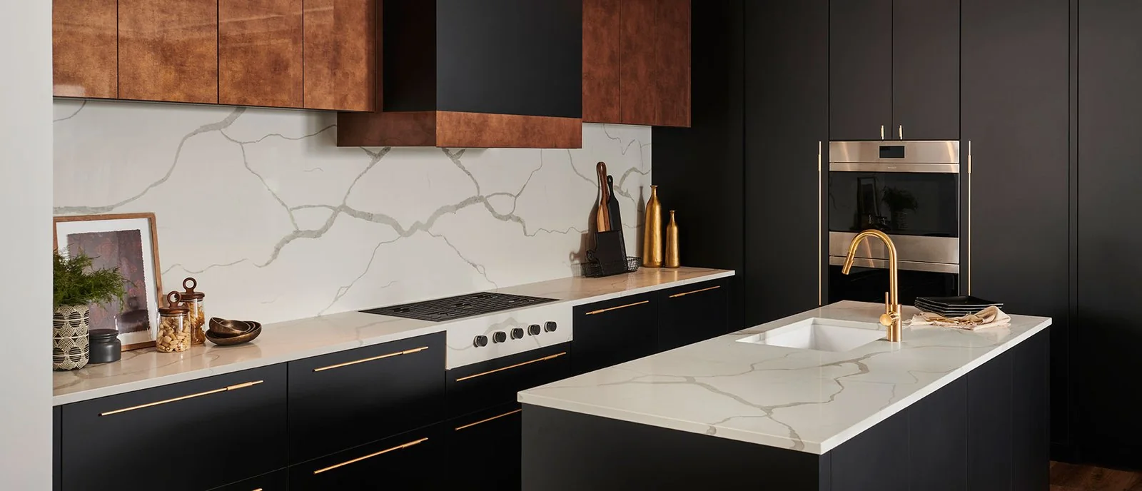
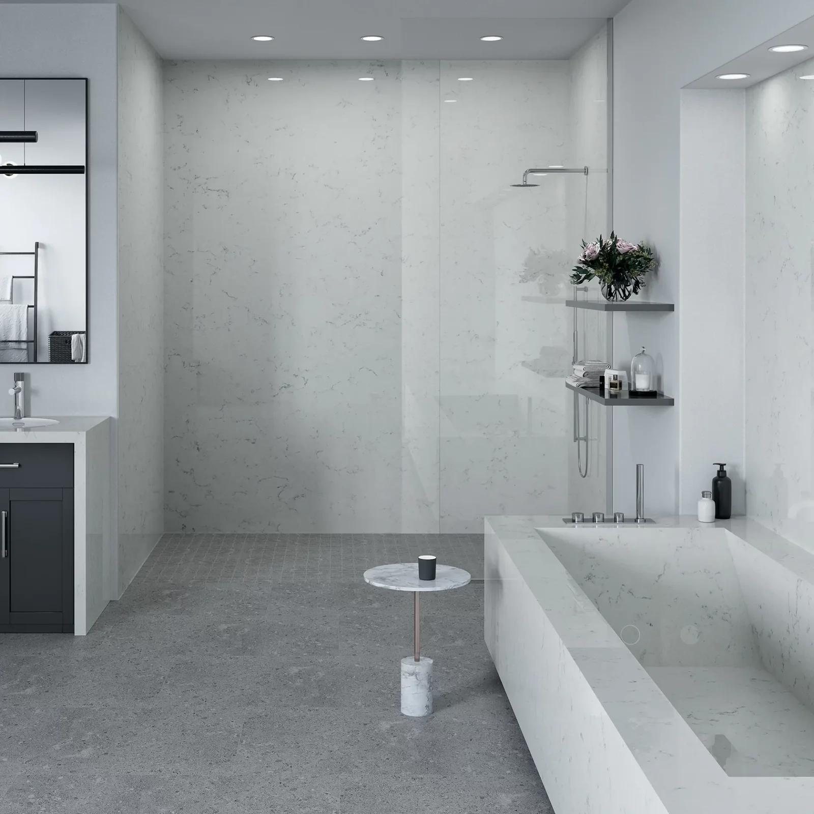
5. Calacatta Classique: veining as a focal point
Calacatta Classique offers a white, marble-inspired direction with visible gray veining. It is worth comparing when you want the island or a backsplash panel to draw attention.
Review the full slab and proposed cut layout. The portion used around a sink can look different from the broad pattern visible in a manufacturer room scene.
6. Gray Lagoon: gray with warmer accents
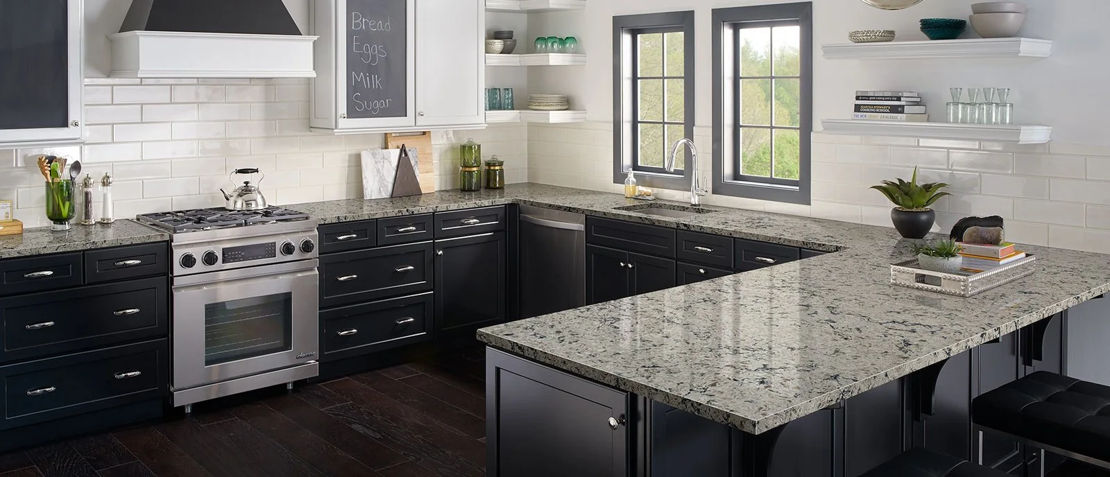
MSI describes Gray Lagoon as combining cool grays and warm golds. That mix can help connect gray elements with warmer finishes elsewhere in the room.
Compare the exact finish you are considering. A polished sample and a differently finished reference image may produce different impressions even when they share a color name.
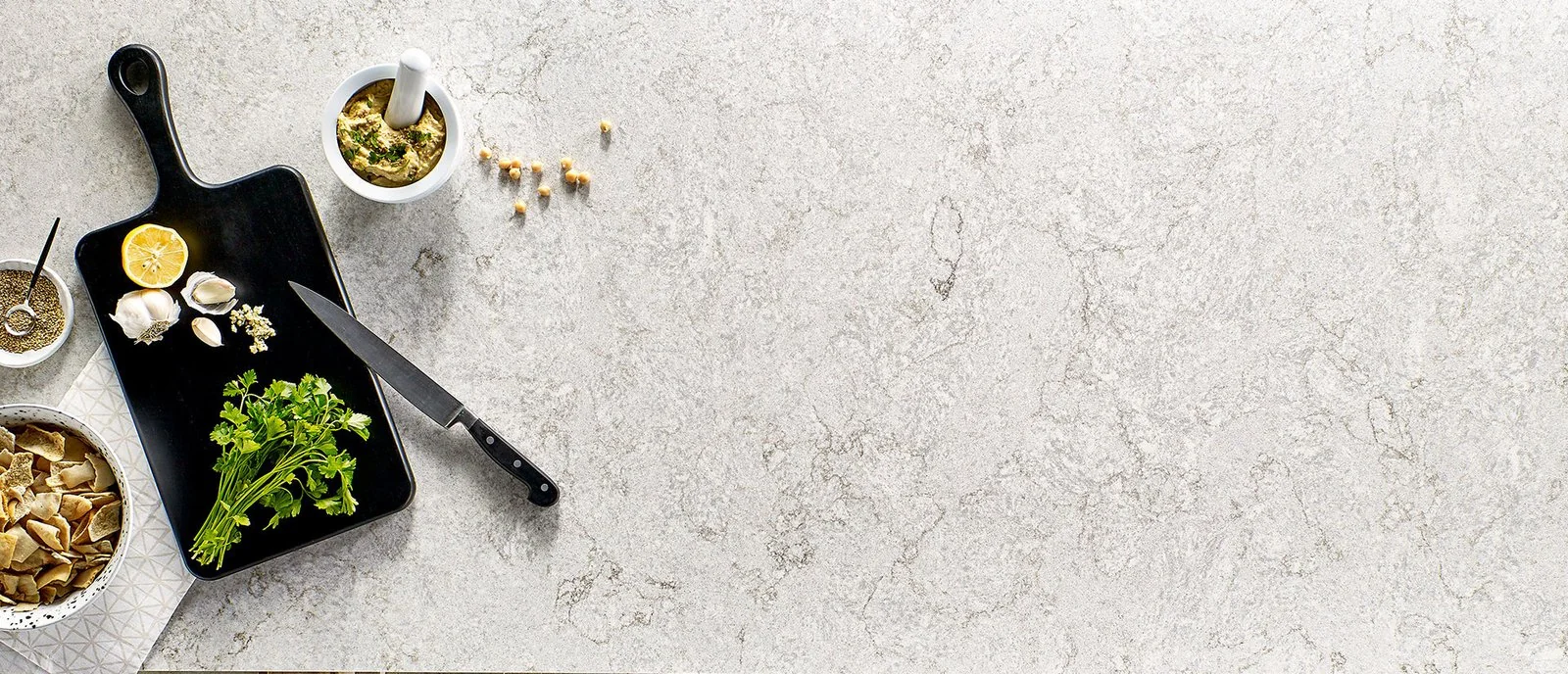
7. Concerto: a restrained gray option
Concerto is a light gray design with darker speckling, rather than a deep charcoal slab. Its quieter scale can work when you want contrast without large directional veins.
Place the sample beside white cabinetry and then beside wood. The same gray can appear more pronounced or more subdued depending on what surrounds it.
8. Carrara Grigio: warm white inspiration
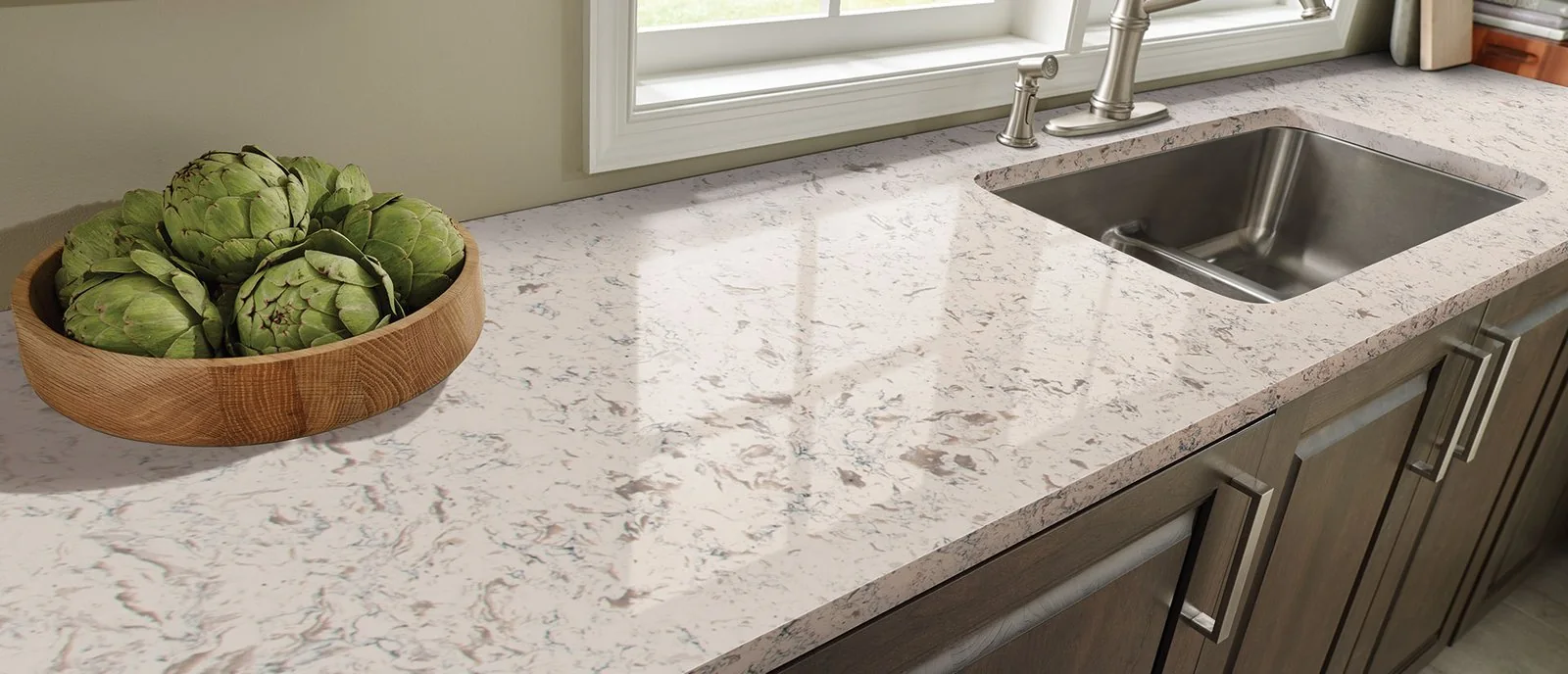
Carrara Grigio provides a reference for a warm white surface with soft clouding and veining. Despite the name, do not assume that every Carrara-inspired quartz has cool gray undertones.
MSI marks Carrara Grigio as removed or discontinued. Use its appearance to guide a conversation about current alternatives, especially when coordinating with warm cabinets or tile.
9. Romano White: movement within a pale palette
Romano White combines white and gray with warmer details, offering more movement than its name alone suggests. It is a useful visual reference if you want a pale surface with a layered pattern.
MSI marks Romano White as removed or discontinued. Ask the team to identify what you like about it before narrowing down available substitutes.
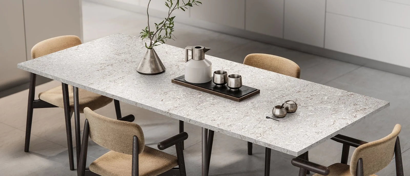
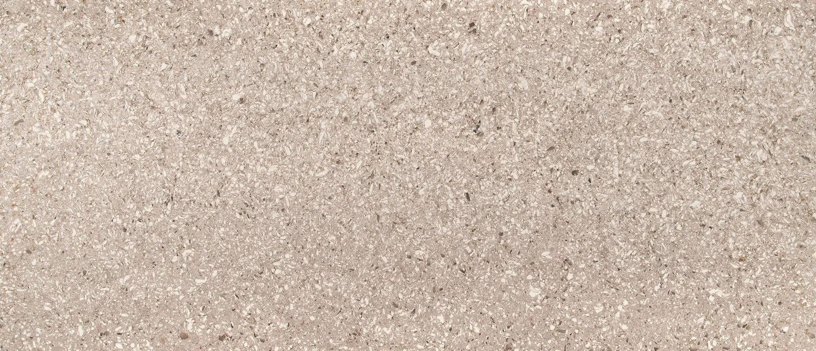
10. Pacific Salt: a mixed neutral reference
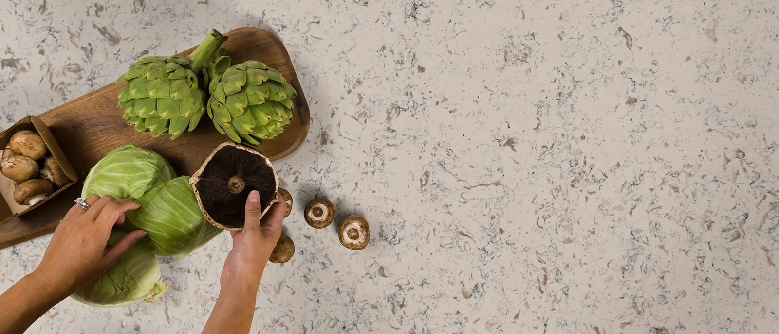
Pacific Salt brings together cream, gray, and brown in a more varied pattern. That combination can inform a kitchen palette that connects light finishes with existing wood or darker accents.
MSI marks Pacific Salt as removed or discontinued. If you like the overall effect, compare current samples for pattern scale as well as color, since a match in undertone alone may feel different.
Compare the effect you want
| Color direction | Examples from this guide | What to check in your room |
|---|---|---|
| Bright, textured white | Sparkling White | Reflections and contrast with cabinets |
| Soft or warm white | Glacier White, Carrara Grigio | Undertones beside tile and paint |
| Pale stone-inspired pattern | Rocky Mountain, Romano White | Movement across a larger surface |
| Warm, detailed neutral | Chakra Beige, Pacific Salt | Balance with wood and flooring |
| Marble-inspired focal point | Calacatta Classique | Vein direction and seam placement |
| Gray with subtle variation | Gray Lagoon, Concerto | Warm accents, finish, and contrast |
The discontinued examples in this table describe design directions. A reference image does not establish what can be ordered for your project.
Test the sample before deciding
Place samples horizontally in the kitchen and compare them in daylight and evening lighting. Keep the cabinet, backsplash, and floor references together so you can evaluate the combination.
Step back as well as looking closely. A pattern that feels busy in your hand may read quietly across the room, while a bold vein may become the main feature of an island.
If you are comparing quartz with natural marble, separate the appearance decision from the care decision. Similar-looking surfaces do not necessarily behave the same way around spills and everyday use.
Connect color to the project plan
For a countertop replacement, existing cabinets and backsplash transitions help define the choices. Confirm thickness, edge details, sinks, and the final template before fabrication.
Color alone does not establish the budget. Slab use, cutouts, removal, and installation all contribute to the scope, and Top Granite's 5-year workmanship warranty is separate from any manufacturer product coverage.
Frequently asked questions
Is white quartz the best choice for every kitchen?
No. White can be a versatile starting point, but its undertone and pattern need to work with the room. A warmer neutral or gray may connect better with finishes you already have.
Can I order a discontinued quartz color?
Do not assume so. Ask about confirmed remaining stock or suitable remnants, and compare current alternatives before planning around an older product name or reference photograph.
Should the countertop match the backsplash exactly?
It does not have to. Decide whether you want continuity or contrast, then compare actual samples together. Two nearly matching whites can look less intentional than a clearly coordinated combination.
Find your color and plan the next step
Use the Budget planner to organize your countertop ideas and project requirements. For help comparing available colors, contact Top Granite at 206-653-4479, serving greater Seattle and the Eastside from Lynnwood.